CONTENT management system
About the Project
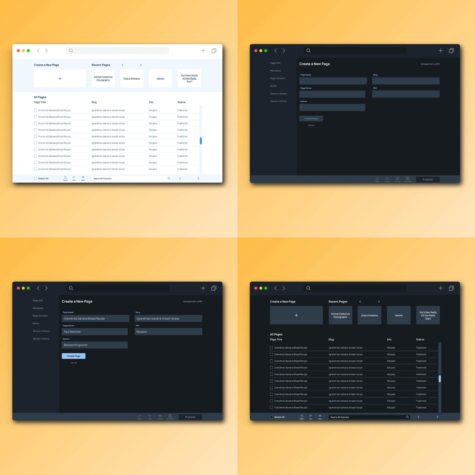
The dark mode site dashboard
Project Introduction
This CMS is used to add, edit and maintain content across sites that collectively hold approximately 18,000 pages. Users input an average of 50 pages per day, with high points reaching 150 pages per day. It also houses various tools, resources, and image databases. Its users range from daily power users to infrequent “I need to fix something but I’m scared” users.
The Challenge
The previous system did what was needed. However, the interface was confusing, cluttered, filled with redundancies, and inefficient. This made it difficult to use and it was particularly prone to user error. With 50-150 pages going up daily, speed, efficiency, and QA are of the utmost importance. As the company and its sites grew, the CMS hindered its growth and efficiency. In addition, the usability challenges of the system led to poor internal adoption, with many users stating that they were afraid to use the CMS for fear of breaking it, or breaking the pages they were tasked to work on.
The Solution
A complete overhaul of the system was required. The CMS was audited for redundancies, and unnecessary information was purged. The user flow and the UI was revamped, focusing on clear navigation between pages, and an intuitive data input flow. Inspiration came from WordPress, Drupal and Squarespace.
User Survey & USer priorities
There were a number of challenges and goals that were identified in the user surveys, which informed my game plan for this project. The users were encouraged to get granular and nitpicky.
User Priorities
Be able to navigate quickly and efficiently throughout the platform
More intuitive data input
Reduce field redundancies
Build in “roadblocks” that would prevent user error
Ie character limits, forbidding all caps etc
User Personas
Since this CMS was an essential tool in the everyday functioning of the company, I had the pleasure of using real life colleagues for my user personas. Names have been changed to protect the innocent.
-
Who is Angie?
Angie has a boatload of experience using not only the in-house CMS but external CMS as well. Angie is a QA powerhouse and has an exquisite attention to detail. Things rarely get past her. She thrives on processes and procedures and excels when she is supported by well functioning systems.
What are Angie’s main goals?
Angie’s main goal is to be able to quickly and efficiently complete her tasks in the CMS so she can move on to the next like the rockstar she is.
What is Angie’s main barrier to achieving these goals?
Getting trapped in a draconian system filled with nonessential redundancies and inefficient functions.
-
Who is Susan?
Susan is a newbie. She has never used a CMS before but is relatively technologically proficient. She knows what a PDF is but code strings strike fear in her heart. She just got the job at the company and wants to succeed. She is an independent self-starter and dislikes asking for help.
What are Susan’s main goals?
To do well during her onboarding and complete tasks without much fuss.
What is Susan’s main barrier to achieving these goals?
She’s never done it before!
-
Who is Michael?
Michael is a long time employee, but has not adopted the CMS and avoids using it at all costs. Michael has a lot of tasks on his plate and deals with a lot of pressure. For many reasons, he prefers to delegate CMS tasks to other people.
What are Michael’s main goals?
To get in and out of the CMS without too much pain and suffering.
What is Michael’s main barrier to achieving these goals?
The current CMS is difficult to use and confusing to navigate, so Michael feels overwhelmed before he even gets started.
what went wrong?
Well. I went into my first testing round very confident that I had solved every problem they had ever had, just like that. Boy was I wrong.
My first priority was to implement a functional left side navigation and module style interface so that the most important information was readily available and easy to find. In testing, those two things performed very well.
My familiarity with the platform blinded me to the severe challenges from the content input perspective. Previously, the CMS had expandable sections that hid the content within them. Eventually, when you had 14 sections open, it was close to impossible to find the content you needed to work on. Continuing to rely on that structure was a problem.
I am grateful that my first testing round failed miserably, because it opened my eyes to how big of a problem these users were facing. A pretty UI alone would not help here.
Content nested with its “parent” heading. Nightmare fuel.
This page in particular struck fear in users’ hearts.
how i fixed it
I dove back into my research and talked to users many, many more times. I asked for their help!
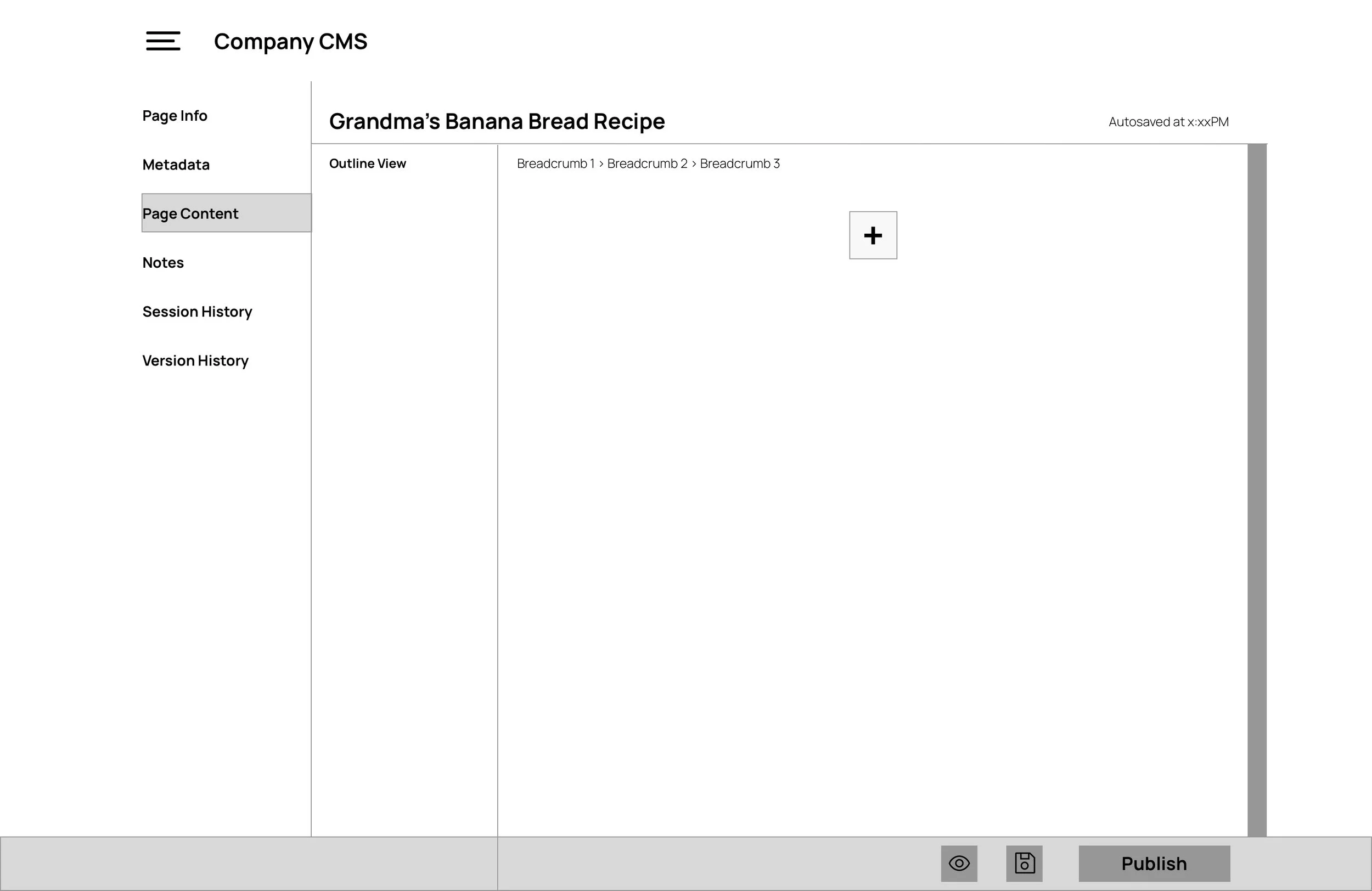
I switched to a more familiar content input structure, similar to WordPress, Squarespace and others. Content is no longer hidden within expandable sections, and it appears in the CMS how it would (relatively) on the live website.
I added Outline View, enabling users to navigate quickly within the content and to get a birds eye view.
I simplified the bottom menu bar, filter/search, forms and content inputs.
The much more simplified version of adding content
interactive prototype
Explore the CMS and yes, the light/dark toggle works and only took 14 hours to map!
high fidelity mockups
Mockups were completed in Sketch.
Light Mode
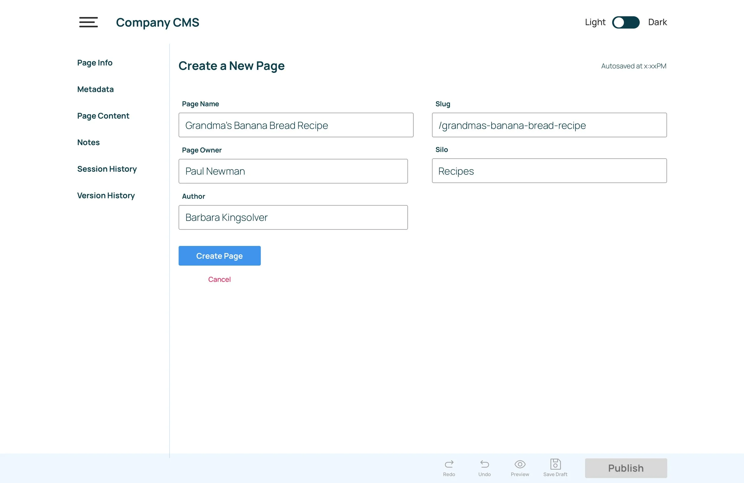
Creating a new page
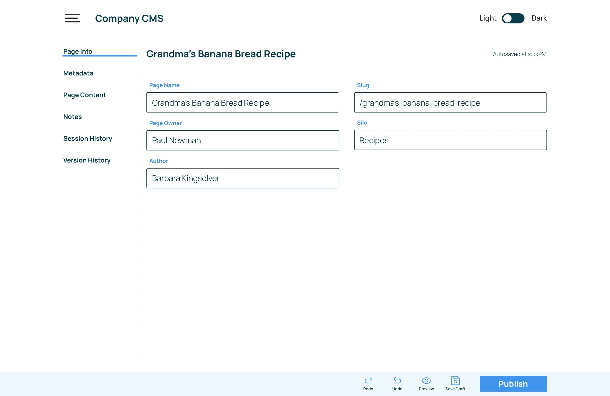
Page information
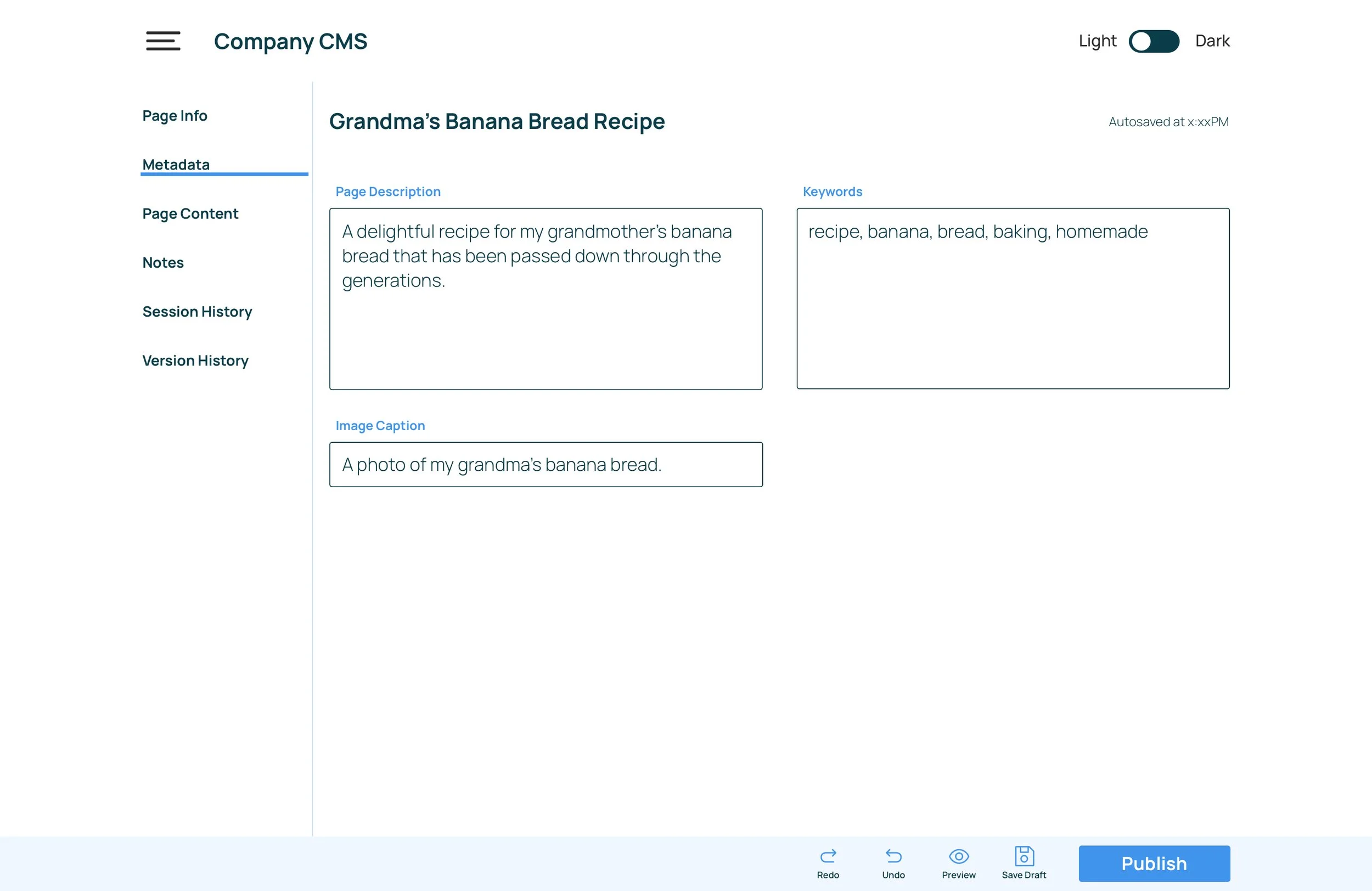
Entering and editing metadata
Entering content
Dark Mode
Site dashboard
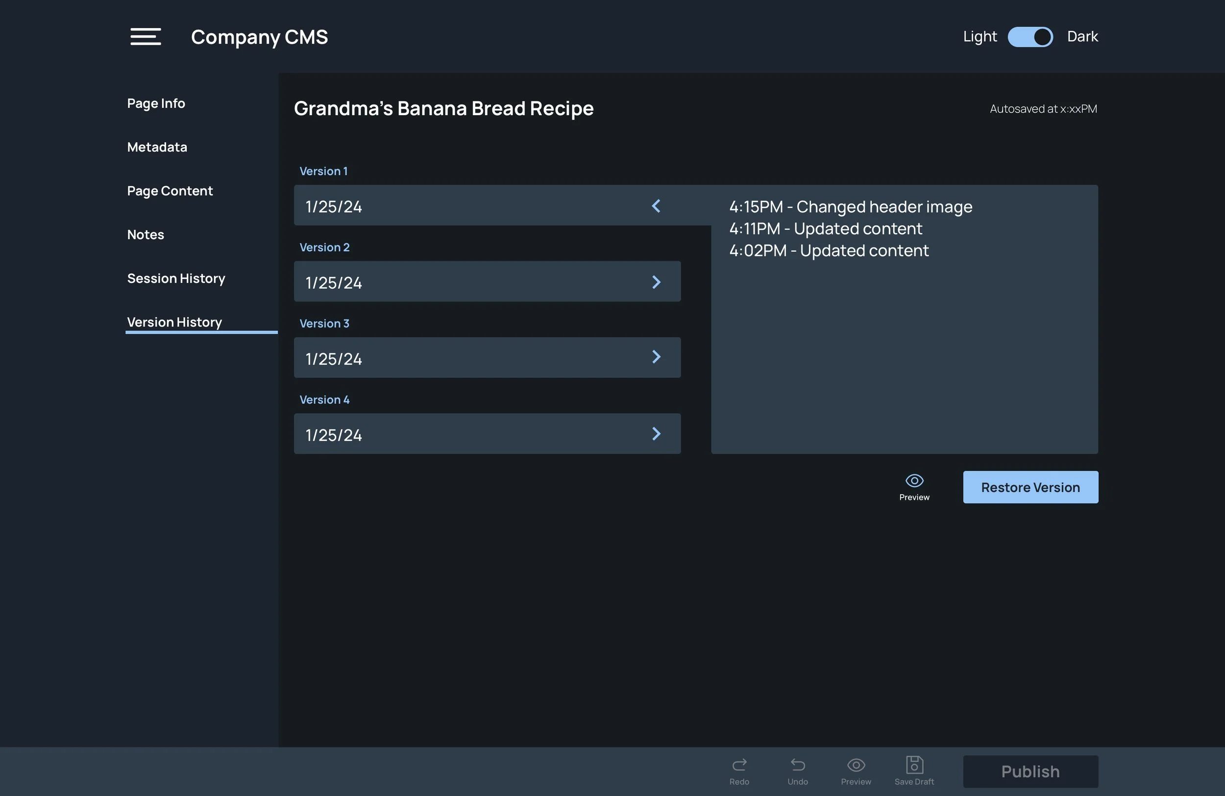
Page version history
Entering and editing page notes
Completed content

